Farmhouse Color Schemes for a Curated Southern Home


A lot of homeowners across South Georgia and North Florida are standing in the same spot right now. They love the warmth of farmhouse interiors, but the actual color decisions feel harder than they expected. One white looks too yellow, another feels cold, and the green they liked online suddenly looks flat in the room.
That hesitation makes sense. Farmhouse color schemes look effortless only when the layers are doing their job subtly. The wall color, wood tone, metal finish, natural light, and even humidity all affect whether the room feels like a curated sanctuary or just unfinished.
Modern farmhouse remains a strong style choice because it balances comfort with restraint. In the modern farmhouse style, which ranks as the top interior design trend for 2025, 68% of homeowners choose warm white or cream as their primary wall color, while 42% use sage green as a secondary accent hue to shape that calm, collected feeling, according to this 2025 trend reference. For homeowners gathering ideas room by room, it also helps to explore farmhouse kitchen styles and see how cabinetry, backsplash, and paint work together.
A timeless result usually starts with confidence in the base layers, then moves into the details that personalize the home. Painted finishes can play a major role in that mix, especially for anyone drawn to character-rich pieces like hand-painted furniture accents.
Creating Your Heirloom-Quality Farmhouse Home
Farmhouse style works best when it feels lived-in, not staged. The goal isn't to recreate a barn or make every room rustic. The goal is to create a home that feels collected, well-suited, and welcoming, with enough simplicity that everyday life still looks good inside it.
For many households, the confusion starts with the name itself. “Farmhouse” sounds casual, but the strongest rooms are carefully edited. They rely on soft neutrals, disciplined contrast, and materials that age well.
Why the Look Still Resonates
The appeal is easy to understand. Farmhouse interiors soften hard architectural lines and make open spaces feel grounded. They also leave room for personal style, whether that leans more traditional, more modern, or slightly coastal.
A strong farmhouse room feels comfortable first and decorated second.
That's especially important in South Georgia and North Florida, where homes often carry bright natural light, family traffic, and a mix of indoor-outdoor living. A successful palette has to hold up in all of it.
What Homeowners Usually Get Stuck On
The most common stumbling blocks tend to be practical:
- White paint confusion because undertones shift from morning to afternoon.
- Accent overload when black, wood, green, and patterned textiles all compete at once.
- Mismatch between paint and furnishings so the room feels pieced together instead of intentional.
- Climate-related surprises when a color that looked creamy in another region reads muddy in coastal light.
Those problems don't mean the style is difficult. They mean the style needs a framework.
The Foundations of Farmhouse Color
The cleanest farmhouse rooms follow a clear visual hierarchy. They don't rely on random decorating instinct. They use proportion.

A widely used modern farmhouse approach places foundational neutrals across about 70 to 80% of the room, dark contrast tones across 15 to 20%, and muted color in the remaining 5 to 10%. That structure comes from this modern farmhouse palette guide. For readers comparing options before committing, a practical companion is this guide to picking the perfect paint color for your home.
The Neutral Base Carries the Room
Neutrals do most of the heavy lifting. White, off-white, gray, and greige create the open backdrop that lets farmhouse spaces breathe. They also give wood grain, iron finishes, woven fibers, and collected accessories room to stand out.
That neutral field should feel warm enough to be inviting, but not so creamy that it turns heavy. In farmhouse interiors, warmth usually comes from undertone rather than obvious pigment.
Dark Contrast Creates Definition
Without contrast, farmhouse rooms can drift into blandness. The dark layer gives the room its edges. Black window frames, deep charcoal lighting, navy cabinets, or a nearly black console can sharpen the look without making it formal.
Often, people overcorrect. They add too much black and the room starts to feel industrial instead of farmhouse. The contrast should define the architecture, not dominate it.
Practical rule: If a room already has strong black fixtures, let those fixtures count as part of the dark layer before adding more dark furniture or paint.
Muted Color Adds Personality
The final layer is the easiest to overdo and the easiest to get right once it's understood. Muted greens, earthy clay notes, dusty blues, and weathered botanical shades add life, but only in small doses. A painted island, a pair of accent chairs, pottery, or textiles usually does enough.
A simple way to think about the hierarchy is this:
| Layer | What it includes | Visual job |
|---|---|---|
| Neutral foundation | Walls, larger upholstery, rugs, cabinetry | Opens the room and keeps it calm |
| Dark contrast | Hardware, frames, lighting, occasional furniture | Adds structure and graphic clarity |
| Muted color | Accent pieces, select textiles, one painted focal point | Brings softness and personality |
The beauty of farmhouse color schemes is that they aren't random. They're balanced.
Choosing Your Palette With Practical Advice
The right palette on paper can still disappoint in a real house. Light changes it. Ceiling height changes it. Flooring changes it. In South Georgia and North Florida, strong sun changes almost everything.
A sample that looks cozy online may read washed out on a bright wall by noon. Another that looked soft in a store may turn yellow or muddy once it's surrounded by warm flooring and moisture-rich air.
Read the Light Before Reading the Swatch
Start with the room, not the paint deck. A north-facing room often supports warmer neutrals because the light can feel cooler and flatter. A west-facing room may need restraint because late-day sun can intensify warmth and deepen cream tones more than expected.
Large open-plan areas deserve extra care. A farmhouse palette has to flow from one zone to another without abrupt shifts, especially where kitchen, dining, and living spaces share sightlines.
Watch Undertones More Than Color Names
Names are charming, but undertones decide the outcome. Two whites can both look “soft” in the store and behave very differently once they sit beside black hardware, oak floors, or stone counters.
A smart evaluation process usually looks like this:
- Test beside fixed finishes like floors, counters, tile, and trim.
- Check morning and evening light because undertones can flip during the day.
- View from the next room so the palette feels connected, not isolated.
- Compare matte samples to shinier surfaces to catch glare before the room is painted.
Homeowners who want an outside perspective before buying paint sometimes book a colour consultation to narrow down undertones and avoid expensive second guesses. Color can also come from sources beyond the wall, which is why many rooms benefit from ideas on how to add color without painting.
Scale Matters More Than Most People Expect
One accent color across a throw pillow is a whisper. The same color across lower cabinetry or a full wall becomes a statement. Farmhouse palettes generally feel strongest when the room has one clear focal move and several supporting ones.
Small test patches often mislead. A color that feels gentle in a tiny square can feel much stronger once it fills an entire wall.
That's why restraint usually wins. If the room already has strong wood character or patterned textiles, the paint should often step back.
Sample Farmhouse Palettes and Color Codes
Some homeowners choose better from examples than from theory. A sample palette gives shape to the mood before any paint goes on the wall.
The combinations below are editorial starting points. They're meant to help with direction, not lock a room into a rigid formula.
Classic and Cozy
This version leans warm, relaxed, and familiar. It suits living rooms, dining rooms, and bedrooms that need softness without feeling overly formal.
| Palette Name | Color Role | Color Name Example | HEX/RGB | Usage Notes |
|---|---|---|---|---|
| Classic and Cozy | Primary wall | Warm Linen | #F3EDE3 / RGB 243, 237, 227 | Creates a gentle backdrop for natural wood and woven textures |
| Classic and Cozy | Trim | Soft Cream White | #FAF7F0 / RGB 250, 247, 240 | Keeps contrast low and polished |
| Classic and Cozy | Accent | Sage Meadow | #A7B29A / RGB 167, 178, 154 | Works well in textiles, painted furniture, or a pantry door |
| Classic and Cozy | Contrast | Iron Charcoal | #3B3D3F / RGB 59, 61, 63 | Best for lighting, frames, or hardware |
Modern and Crisp
This palette suits homeowners who like farmhouse style with cleaner edges. It works especially well in kitchens, entryways, and spaces with black metal details.
| Palette Name | Color Role | Color Name Example | HEX/RGB | Usage Notes |
|---|---|---|---|---|
| Modern and Crisp | Primary wall | Clean Greige | #E7E2DA / RGB 231, 226, 218 | Feels airy without going stark |
| Modern and Crisp | Trim | Clear Soft White | #F8F8F4 / RGB 248, 248, 244 | Sharpens architectural lines |
| Modern and Crisp | Accent | Dusty Olive | #8F9A84 / RGB 143, 154, 132 | Adds depth without stealing focus |
| Modern and Crisp | Contrast | Deep Slate Navy | #394655 / RGB 57, 70, 85 | Strong choice for a built-in or island |
Coastal Farmhouse
This version fits homes that want farmhouse warmth with a lighter regional feel. It pairs especially well with casual dining spaces, sunrooms, and homes near the coast.
| Palette Name | Color Role | Color Name Example | HEX/RGB | Usage Notes |
|---|---|---|---|---|
| Coastal Farmhouse | Primary wall | Sandy Beige | #E9DECF / RGB 233, 222, 207 | Softens bright light and feels grounded |
| Coastal Farmhouse | Trim | Sea Salt White | #F6F5EF / RGB 246, 245, 239 | Keeps the room fresh and open |
| Coastal Farmhouse | Accent | Weathered Blue Green | #94AEB0 / RGB 148, 174, 176 | Best in accessories, stools, or a painted console |
| Coastal Farmhouse | Contrast | Driftwood Graphite | #4A4D50 / RGB 74, 77, 80 | Adds enough structure to hold the palette together |
A good palette should still leave room for natural materials. If every surface is painted and every tone is prescribed too tightly, farmhouse style loses the relaxed quality that makes it appealing.
Pairing Colors With Furniture and Finishes
Paint alone can't carry farmhouse style. The room starts to feel authentic when color meets texture in a believable way.
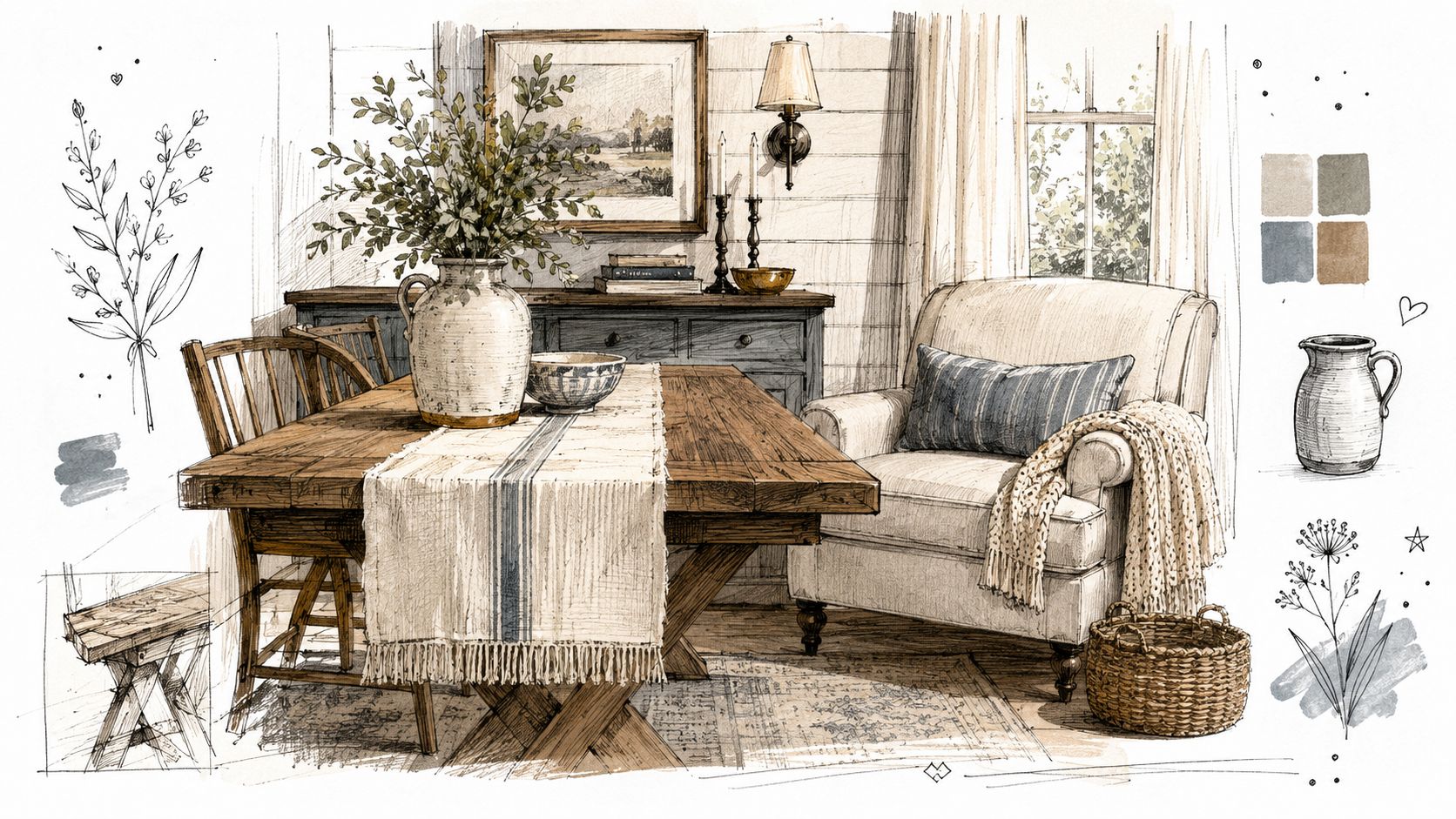
One of the clearest technical ideas behind successful farmhouse spaces is that texture validates the palette. Matte or lime-washed finishes create a low-reflectivity backdrop for wood grain and metal accents, and expert analysis phrases it plainly: “the secret to making it farmhouse appropriate is texture” in this design discussion on farmhouse materials and finish interaction. Readers who want more visual examples can also browse farmhouse color and furniture tips and compare how seating, tables, and accessories shape the mood.
Start With Finish Before Fabric
A matte wall finish usually behaves better in farmhouse interiors than a glossy one. It lets the wall recede, which makes reclaimed wood, oak, walnut, and metal details feel richer. If the walls reflect too much light, the room can start to feel slick rather than grounded.
Furniture finishes should add variation, not noise. A washed wood dining table, a darkened iron base, and a soft woven seat can all live in the same room if each one serves a different visual role.
Use Contrast in Materials, Not Only Color
A farmhouse room often succeeds because of material contrast:
- Smooth against grainy with painted cabinetry near rustic wood shelving
- Soft against structured with slipcovered seating near a heavier table
- Muted against dark with pale upholstery and black hardware
- Natural against refined with linen, cotton, leather, and forged metal
This is also where upholstery matters. Fabric texture changes how the palette reads. Nubby weaves make whites feel warmer. Tight, flat fabrics can make the same white feel sharper. That's why a room plan usually benefits from understanding upholstery material choices and performance considerations.
A farmhouse palette shouldn't stop at the paint chip. It should continue through wood finish, fabric hand, hardware sheen, and the visual weight of each piece.
Let a Few Furnishings Carry the Character
Not every item needs to announce the style. A room often feels stronger when only a few pieces do the talking.
- Dining spaces can rely on a sturdy wood table, simple ladder-back or upholstered chairs, and restrained metal lighting.
- Living rooms often benefit from one well-structured sofa, one textural accent chair, and a cabinet or console with visible grain.
- Bedrooms usually feel more settled with soft bedding, an uncomplicated bed shape, and one contrasting painted or stained piece.
That restraint gives farmhouse color schemes staying power. The room feels collected, not themed.
Adapting Farmhouse Style for North Florida and South Georgia
Regional light changes farmhouse color more than many national guides admit. A creamy white that looks mellow in another climate can turn muddy under bright coastal exposure. A soft green can lose definition if humidity and glare flatten it.

That's why local adaptation matters. Existing content rarely addresses the high-heat, humid climate of South Georgia and North Florida, where standard creamy whites can oxidize or look muddy in intense coastal sun, which is why designers need to think about UV-stable and moisture-resistant undertones, as noted in this regional farmhouse color discussion. Spaces that blur indoor and outdoor living often benefit from ideas developed for regional sunrooms and transitional spaces, such as these principles for decorating a Florida room.
A Fernandina Beach Approach
A coastal homeowner might begin with a sandy neutral on the walls instead of a heavy cream. That single shift can keep the house from feeling yellow in strong daylight. Then the room can bring in weathered blue-green through smaller accents, with driftwood tones and matte black details grounding the scheme.
That version still reads farmhouse. It specifically reads farmhouse through a local lens.
A Waycross or Inland Approach
An inland home with deeper porches, tree-filtered light, or richer flooring may support warmer neutrals more easily. In those settings, a greige or warm white can feel settled rather than bright, especially if the room includes honey oak, antique wood, or darker textiles.
The trick is to let the architecture guide the temperature of the palette. Homes with stronger sun often benefit from cleaner undertones. Homes with softer light can carry more warmth.
Room-by-Room Local Adjustments
A practical local edit often looks like this:
- Living room: In a west-facing room, watch late-day warmth carefully so whites don't turn overly golden.
- Kitchen: Use finishes that can handle moisture and repeated cleaning, especially around cooking zones.
- Bedroom: Let softer, dusty color appear in textiles first before committing it to all four walls.
- Porch-adjacent spaces: Pull in natural fibers, muted coastal shades, and easy-clean surfaces that suit the indoor-outdoor rhythm.
Regional design isn't about abandoning farmhouse style. It's about translating it so the home looks right in its own light.
That's what makes local farmhouse interiors feel convincing. They honor the style, but they also honor the climate.
Bring Your Vision to Life With Lott's Furniture
The best farmhouse rooms don't come together from memory or impulse. They come together through testing. Paint samples need to be viewed in changing light. Fabrics need to be touched. Wood finishes need to be seen beside the actual wall color, not just imagined.
Lighting deserves the same level of care. In farmhouse dining rooms, the standard rule is to hang pendant fixtures 30 to 36 inches above the table, with a fixture diameter 12 inches less than the table's width, according to this farmhouse dining lighting reference. That kind of proportion keeps a dining area comfortable and visually balanced instead of crowded.
A Smoother Way to Pull the Room Together
For homeowners across South Georgia and North Florida, a thoughtful process often includes both digital planning and in-person review. Browsing a catalog online helps narrow the look. Visiting a showroom helps confirm scale, comfort, finish, and color in real life.
Helpful support can make those choices easier:
- Style Quizzes can help identify whether the room leans more classic farmhouse, modern farmhouse, or coastal farmhouse.
- In-store associates can help compare finishes, fabrics, and silhouettes without turning the process into guesswork.
- The Mattress Guide is useful when farmhouse style extends into the bedroom and comfort matters as much as appearance.
Personalization Matters in Farmhouse Design
Farmhouse interiors feel timeless when they don't look copied. That's where customization becomes valuable. Special order options make it easier to tailor fabric, finish, and comfort level so the room reflects the household rather than a showroom snapshot.
Many vendors support personalized choices such as:
- Fabric and leather selection for a softer or more structured expression of the palette
- Wood finish options that work with local light and existing flooring
- Comfort adjustments so seating feels as good as the room looks
Core furniture lines known for this kind of design flexibility often include names such as La-Z-Boy, Smith Brothers, Lexington, Stressless, and Hooker Furniture.
Delivery and Final Placement Still Matter
A carefully planned room can lose momentum if the final steps feel careless. White-glove, in-home delivery protects the investment and makes placement easier, especially with larger dining pieces, upholstered seating, or bedroom furniture. A rigorous multi-point inspection before delivery adds another layer of reassurance that the piece will arrive ready for the home, not needing fixes after the fact.
Farmhouse style is approachable, but it isn't accidental. The right neutral, the right undertone, the right finish, and the right furniture scale all work together quietly. That quiet harmony is what gives the room its staying power.
For homeowners ready to shape a polished farmhouse look with local guidance, Lott's Furniture offers a smooth path from inspiration to installation. Browse the digital catalog, take the Style Quizzes, review the Mattress Guide, or connect with in-store associates in Fernandina Beach, FL, for help refining color, finish, and comfort choices. The Special Order Program makes it easy to personalize fabrics, finishes, and seating details, and the white-glove in-home delivery team completes each order with a rigorous multi-point inspection before placement in the home.